Team :
-
Kevin Wen (UX Desinger)
Timeline:
-
July 2023 -- September 2023
-
Justin QianHu (Product manager)
-
Liang Jie (Software Engineer)
Project Overview
I want to share one of my re-design work here. "Data Centre" is a product mainly designed for e-commerce to track their sales datas. I was given the task to redesign the Dashboard page and Home page of the Data Centre.
Problem
Through my research I found the website has the problem of Inefficiency, low discoverability rate and illogical hierarchy. The key information is not obvious enough and the lay-out logic and hierarchy are chaos. Users may waste their time on navigating and looking for the information they want.
Illogical Hierarchy

Low Discoverability

Inefficiency

Solution Overview
I focused on redesign the Dashboard page and Home page by streamlining user flow following logical hierarchy and optimize data information visualization and lay-out.
01
DASHBOARD
Before
After


02
HOME
Before
After


RESEARCH
Research Method
As an intern, I have limited access to the platform and database. And I am not very familiar with the website yet. As a result, how I choose research methods to better understand the functionalities and identify potential issues are very important.
User Interview

To understand user's needs and painpoints.
Walkthrough Observations

To understand the user's workflow and how they interact with the site.
User Interview
I conducted 10 deep user interviews with both my colleagues and business partners who are users of this website.
My goal is to identify their specific needs and pain points they may have encountered.


Walkthrough Observations
walkthrough observation would also be very helpful to understand the user's workflow and how they interact with the site. Through my observation, I learned that users tend to check the information of this website based on the information hierarchy. I create a basic flow based on this insight.

The Accumulated Rate Data
Annual Target
Specific Data
1.The accumulated rate data are the most important information for the web users. Users want to see them in the first place.
2.The second thing users want to look at is how far they are compared to the annual target.
3.Then, they would like to see specific data to help them better understand the situation.
However, these information is scattered and disorganized inside the website at the moment. Users need to spend time navigating and looking for them.
Define
Design Goals
I identified 2 major problems by analyzing the findings from user research, and I formulated distinct design goals and 'How Might We' questions for each problem to offer direction for the redesign process.

Streamline user flow following logical hierarchy.
How might we create a more logical user experience to enhance efficiency.

Optimize data information visualization and lay-out
How might we highlight key information and enhance visualization.
Ideate
Inspiration
I first started looking at some other similar designs for dashboards. And here are some examples I found. I really like the way they use modular blocks to present pieces of information and the way they use colors to prioritize important information.

Using one of my favorite designs from ADPlist as an example, I found most of the designs are using a side menu that facilitates navigation across various information sections. And they are Grouping important information in one place and using icons to prioritize and distinguish them.

And I think these takeaways are great inspirations for me to redesign the home page and dashboard page in order to solve problems like low discovery data and illogical hierarchy.
Sketch & Wireframe
I conducted a brainstorming session to generate redesign ideas with major problems in my mind. And I also sketch the basic lay-out based on my research and interviews.

This type of layout is very common in the web-design field. It provides a good sense to divide information into different parts. But I don’t think it’s appropriate when trying to emphasize hierarchy. But I think it would be good for the home page.

And Based on my research, For the dashboard page, I think it would be better to just simply demonstrate information from top to bottom, based on how important the information is.
Information Architecture
I created an information architecture to decide what information would go into each tab, and utilized simple wireframes to visualize the overall layout, guaranteeing a well-organized and clear interface.

Design
01
DASHBOARD
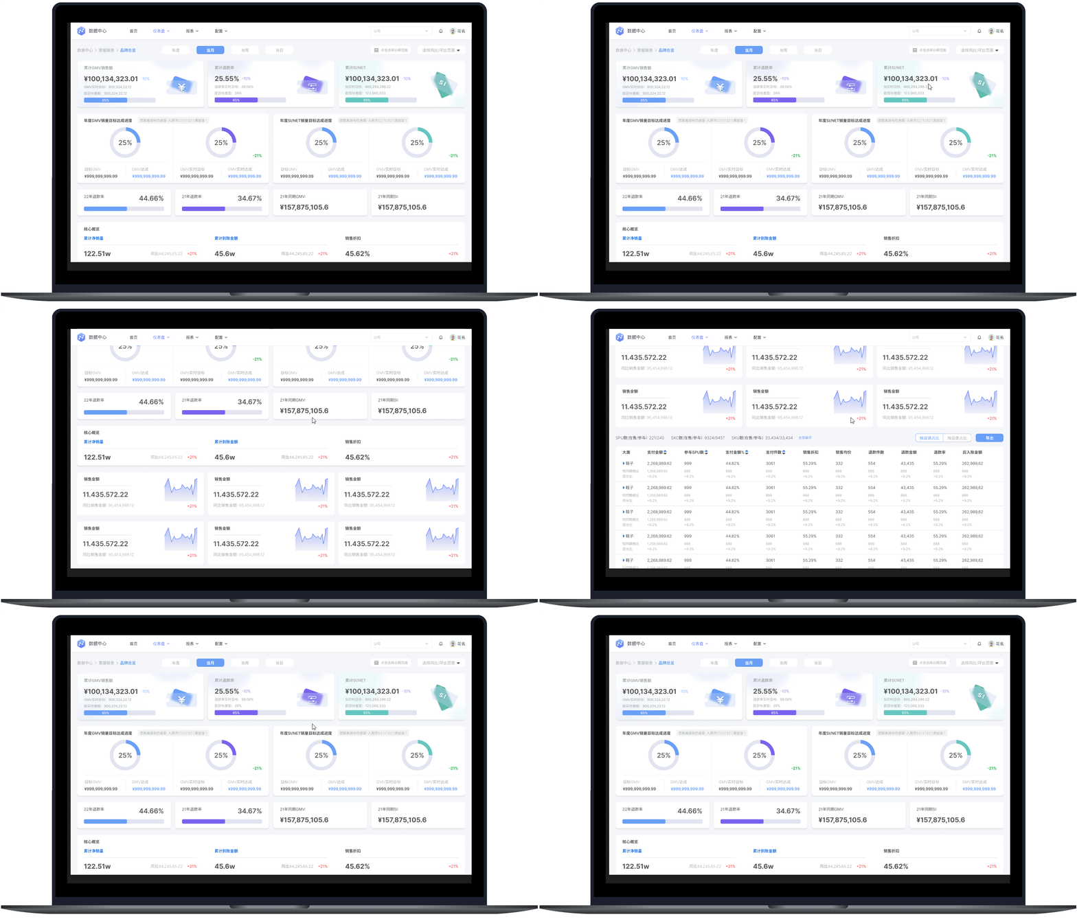
If we look at the original design for the dashboard. We can see the Accumulated Rate Data is on the left side and is too small. And the design is too simple, as the most important information, it should have the highest hierarchy.

After discussing with my product manager and developer, I choose to keep using the card style for “accumulated data”. I choose to use different colors to make every information card more unique. And design special icons for each of them in order to emphasize their importance to users.

Before

Problems:
-
Low discovery rate of important data
-
Hierarchy illogical
-
Failed to present all the important information in one page.


After

Key Improvements:
Streamline user flow and reorganize the lay-out.
Reorganized the sequence of information presentation to improve both efficiency and clarity, enhancing the overall user experience.
Diversified Visualizations and emphasize key information.
Focused on the design of key information (3 accumulated data) to highlight their importance and differentiate from less important information. Established clear hierarchy.
02
HOME
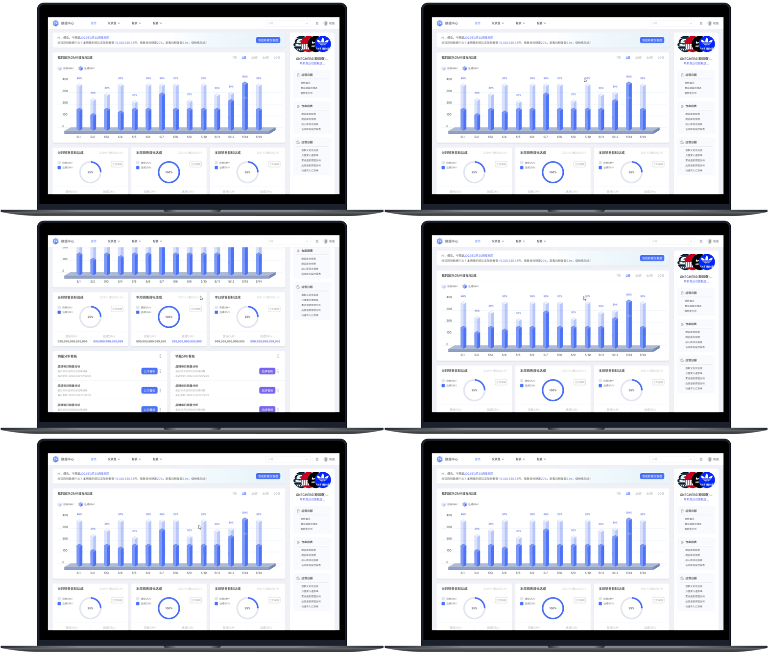
Looking at the original sidebar, we can see the text’s color and font size are really similar here and it’s really hard for users to read. In order to solve this problem, I design icons and dividers for each section and adjust the font size to separate different information sections and make it easier for users to read.


Before

Problems:
-
Inappropriate spatial utilization
-
Over design and inappropriate visualization
After

Key Improvements:
Reorganized spatial utilization based on current lay-out.
Increased the size of the GMV data part to emphasize the key information and decrease the size of welcome board and brand menu to optimize spatial utilization.
Impact
Users expressed high levels of satisfaction with the re-design
After completing the hi-fi prototype, I conducted a follow up user interview with 12 users of the website to evaluate my final solution.

50% improvement in data extraction efficiency

92% interviewee are satisfied with the re-design.
More Works:
During my internship, I also participated in an app design project. This app is for business users to track their order status.
With the help and guidance of my mentor, together we finished wireframing and designing the project.

